Mannerly - Mobile App Prototype
Started
January 2025
Project Type
Mobile App Prototype, UX Case Study
Tools Used
Figma, Adobe illustrator, Adobe Photoshop
Mannerly is an educational travel app prototype mockup, with the concept to help U.S. travelers navigate cultural etiquette in Asian countries, featuring South Korea as its first destination.
Concept
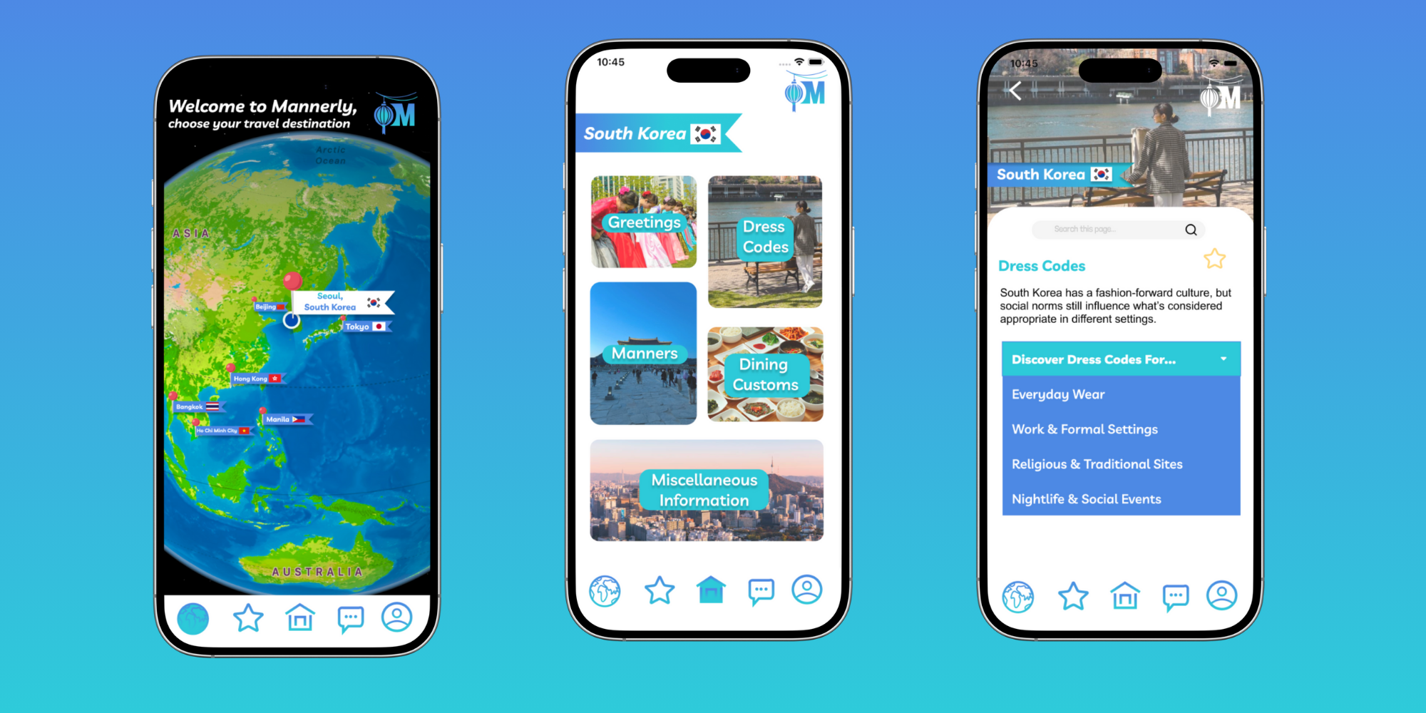
Mannerly is a mockup mobile UX/UI project created to help North American travelers navigate cultural etiquette while visiting Asian countries—beginning with South Korea. The app was designed to make cultural learning more accessible and engaging, offering quick, situation-based etiquette tips that users can easily reference on the go. By blending clear visual design with user-centered functionality, Mannerly provides a meaningful, respectful, and educational experience for travelers seeking to connect across cultures.
Problem
Travelers often feel uncertain about how to act respectfully in new cultural settings, especially when reliable etiquette information is scattered or inconsistent.
During my time living in South Korea, I personally experienced this challenge, wondering what was polite, how to greet others, or what to wear in different settings.
This inspired me to design a tool that delivers practical, trustworthy, and culturally sensitive guidance for Americans traveling abroad.
Solution
To address the lack of accessible, trustworthy etiquette resources for travelers, Mannerly provides an all-in-one mobile experience that combines cultural education with intuitive design. The app organizes etiquette tips into clear categories such as greetings, dining, communication, and dress codes—allowing users to quickly find relevant guidance without scrolling through overwhelming information.
Each feature was designed to promote confidence and cultural sensitivity: users can save pages for offline use, access a real-time chat with locals, and practice short language phrases through an interactive “Practice This Word” tool.
App Research
To define user needs, I conducted surveys, persona creation, and competitive analysis focused on how U.S. travelers learn about cultural etiquette.
User Research: Personas & Empathy Mapping
To better understand potential users, I developed three detailed personas:
Tiffany – A 19-year-old study abroad student who wants to adapt quickly, but is nervous about making cultural mistakes.
David – A 29-year-old digital nomad looking to connect with locals while balancing work.
Sandra – A 35-year-old corporate traveler aiming to maintain professionalism during international meetings.
By mapping out their goals, frustrations, and motivations, I identified a commonset of needs:
Quick access to etiquette information
Real-time guidance
A clean, intuitive experience
Real-time guidance
From this research, I identified key opportunities:
Provide quick access to reliable etiquette information.
Offer interactive and visual learning tools.
- Create a simple, intuitive experience adaptable to different traveler types.
Key Takeaways
User Surveys revealed that over 80% of participants found online etiquette information too broad or outdated.
Competitive Analysis of apps like Culture Trip and Smart Traveler highlighted the lack of real-time, region-specific insights.
Personas represented three traveler types: a student abroad, a business professional, and a digital nomad—each with distinct motivations but common frustrations.
The average time to completion for tasks provided (which involved finding specific information on the website) ranged from 58 to 128 seconds.
From this research, I identified key opportunities:
Provide quick access to reliable etiquette information.
Offer interactive and visual learning tools.
- Create a simple, intuitive experience adaptable to different traveler types.
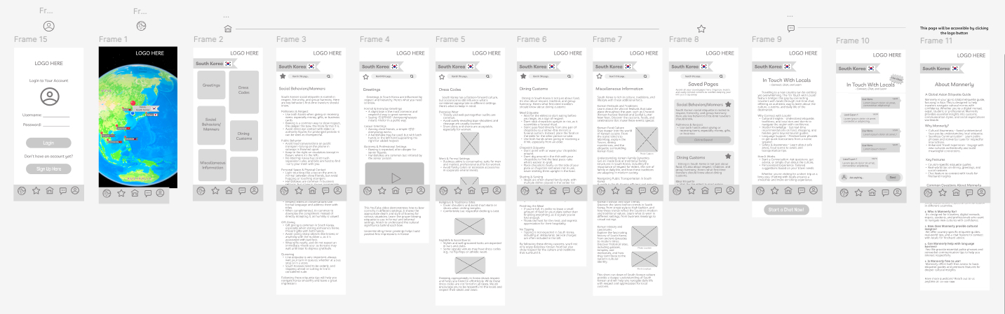
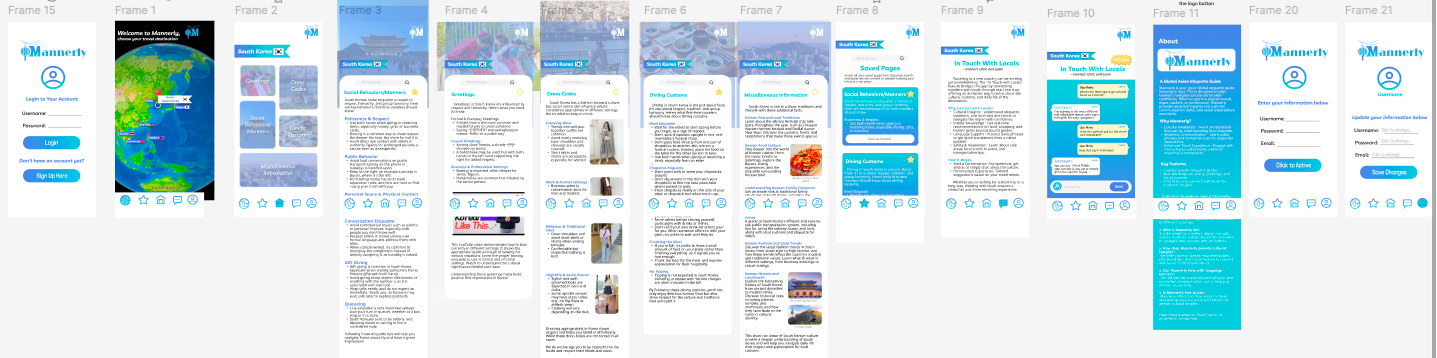
From concept to prototype.
Using a user-centered design (UCD) process, I translated research insights into a functional, high-fidelity prototype designed in Figma. The visual identity emphasizes warmth, respect, and simplicity—using soft neutrals paired with calm accent colors inspired by Korean aesthetics.
Key UI elements include:
- Categorized Etiquette Sections for faster navigation.
- “Practice This Word” feature for basic language learning.
- Saved Pages Tab for offline use.
- Live Chat with Locals for real-time advice.
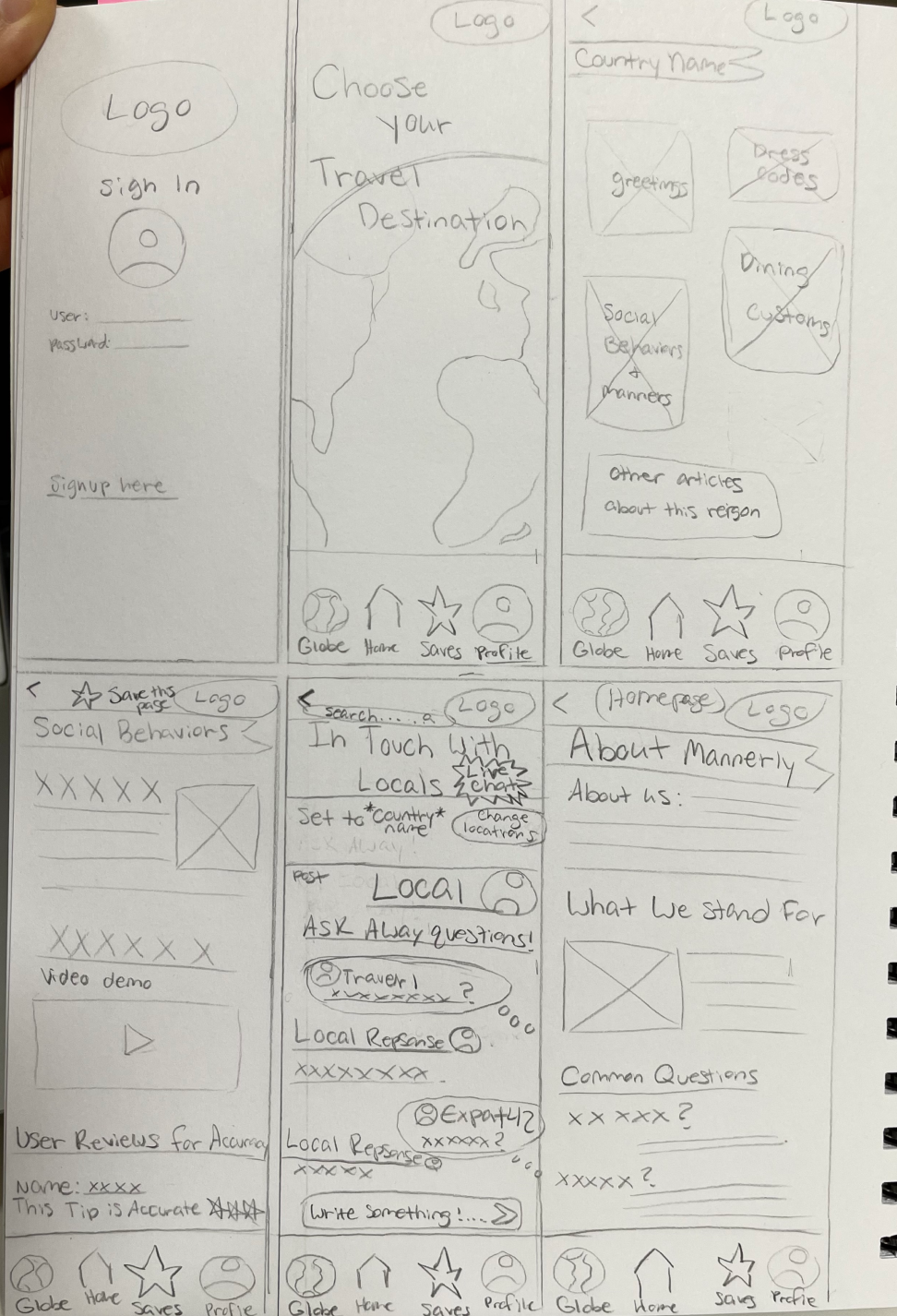
Wireframes progressed from low-fidelity sketches to interactive prototypes, refined through multiple feedback rounds. I also created a demo walkthrough video to illustrate the app’s core user flows and microinteractions.
User Testing
Usability testing with peers identified issues such as inconsistent navigation behavior and overlapping page margins. Based on feedback, I:
- Added back buttons for improved navigation.
Adjusted scroll behavior and dropdown placement for clarity.
Enhanced image visibility and contrast.
Refined the chat feature and linked icons to relevant pages.
These iterative changes improved both usability and aesthetic coherence, making the app feel smoother, more consistent, and user-friendly.
Outcome
The final Mannerly prototype is a clean, high-fidelity mobile design that reflects both research and empathy-driven decision making. It successfully balances educational content with modern UI principles, demonstrating how thoughtful UX can strengthen cultural understanding.
Through this project, I learned how to translate real-world challenges into digital solutions that prioritize inclusivity, accessibility, and cross-cultural awareness. Mannerly represents my belief that design can foster meaningful global connections—one interaction at a time.